Borely
Designing Self-Service
Estimation
Four main questions. 19,008 validated possible outcomes.
per estimate
one truth table
We built it.
Two personas.
Two products hidden inside one brief.
Trenchless construction runs on institutional knowledge: spreadsheets, estimating workbooks, decades of operator experience. Submit, review, iterate, correct, repeat. Everything downstream waited on that cycle: design, procurement, scheduling, contracts.
The brief was simple: build an estimate tool. Colin (founder and director) had named the need; my job was to define what the solution actually had to be. Research split that single brief into two distinct users: different goals, different technical literacy, different stakes.

Colin's original brief was a calculator: configure, get a number, close the tab. No save, no users, no history. That gap was the opportunity: saving an estimate meant accounts, status tracking, client-facing outputs, an entirely new layer. Research had found a second product hiding inside the first. And that layer needed a different user.
John Sargent / The Contractor
John has zero tolerance for friction. One unanswered question and he's gone, permanently. Every decision on the estimate tool was pressure-tested against that fact.
Corey Smith / The Engineering Manager
Corey won't touch the estimate tool until the company earns his trust. His journey starts on the informative site, not the estimator. Evaluation before transaction.
Same endpoint, different readiness. John arrives ready to quote; Corey arrives ready to evaluate. The estimate tool had to serve both: transaction-ready users and still-deciding ones. That duality defined the entire information architecture.

John Sargent
Got a job for ya with us. Send me a price I can give to our client and we'll get on with it.
Bio
Based on a remote project site in Australia, home in Geelong. Well-known in the sector, runs his projects and clients almost entirely from his phone. Weekends are for family, when the job allows it.
Core needs
- Fast turnaround, minimal friction: finish one job, start the next
- Tools that are accessible, simple, reliable, and functional anywhere, anytime
- Subcontractors who are easy to do business with
- Someone else to handle the paperwork so he can stay on the job
Frustrations
- Clients requesting paperwork he doesn't readily have, but must provide to keep the project moving
- Contractor management and inconsistent communication methods
- Not enough time: working on the current job while the next one needs quoting
- Quotes that pull him off-site, needing fast answers from subcontractors to prepare them

Corey Smith
We've got this project and along the pipe path there are some trenchless crossings that we need specialist input, can you help us?
Bio
Based in Brisbane, still taking courses to stay sharp in his field. Career-driven and well-regarded, and just as committed at home as at work.
Core needs
- A content expert with similar skills who can help tackle company goals
- Unbiased preparation, delivery, and review of complex trenchless designs
- Effective presentation of technical material and information
- Scheduled delivery matters more than price
Frustrations
- Can't find information about this specific type of question
- Limited resources internally at his employer
- Unrealistic delivery schedules from clients, needing fast answers passed on
- Limited, hard-to-compare contractor options with inconsistent compliance
With both users defined, the next step was mapping what each actually needed to do. Two flows were visible from the start: the informative website and the estimate tool. The journey mapping would surface a third.

Colin asked for a calculator. Research found two personas, a hidden second product, and now a third flow taking shape. The brief kept getting bigger the closer we looked.
Three paths.
One system.
The product wasn't one journey. It was three, each anchored to a different user and surface. Mapping them separately made the trade-offs visible. Design for one didn't have to compromise the other.
- The Informative WebsiteCorey's evaluative path. Awareness → Consideration → Acquisition → Service → Loyalty. He arrives via Google, peer recommendations, or industry events, validates the company, and only then approaches the estimate tool.
- The Estimate Tool John's happy path. From client request to received estimate to purchase order. Optimised for the minimum number of decisions and the fewest possible questions.
- Estimate Management The end-to-end flow for power users: estimate management, project tracking, and internal tooling for the Borely team.
A third actor emerged from the journey: Kerry-Anne, a trenchless designer at Future Proof Solutions. Before Borely, she and two management-level colleagues spent most of their day on manual quote preparation, invoicing, and financial tracking: the inefficiency Borely was originally built to solve. Her internal panel now receives client-generated estimates, reviews them for commercial accuracy, and converts them into official quotes and purchase orders.
From flat to pillar-led.
The first sitemap was surface-driven. After stakeholder review, it reorganised around construction method pillars: one dedicated page per method, consistent sub-page templates, five methods deep.
Use buttons to zoom · Drag to pan
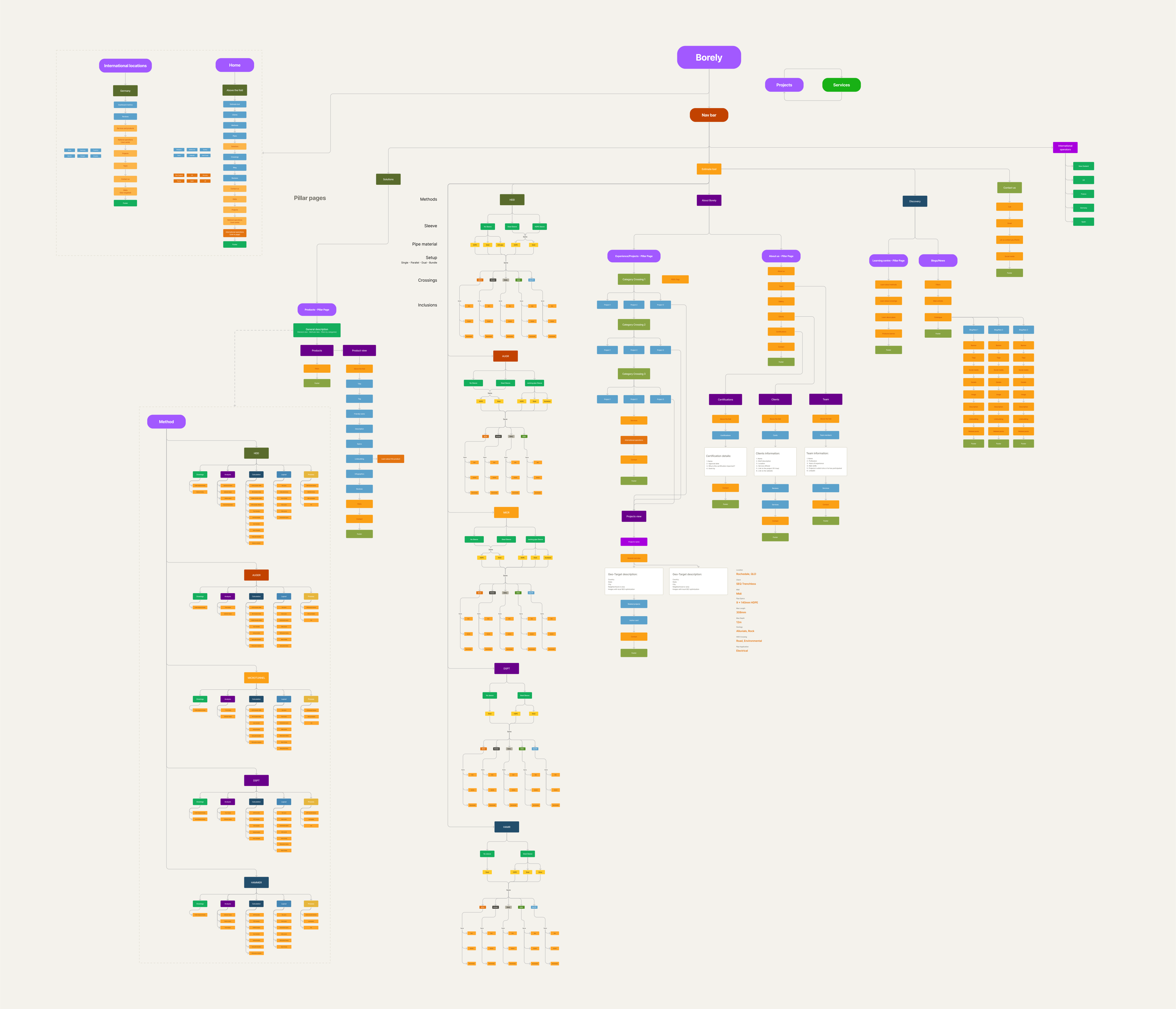
Before committing to the pillar-led structure, I used AI to sweep the reorganised flow for gaps, dead ends, and missing states, catching edge cases a manual walkthrough alone might have missed. The architecture defined what the product had to contain. The next problem was ensuring every path through it resolved into something real and deliverable.
19,008 states.
Four main questions.
Trenchless construction has hard physical constraints. You can't pair certain pipe materials with certain installation methods. You can't run an Outfall crossing using Auger Boring; physics won't allow it. A naïve form that let users pick any combination would produce nonsense estimates, ones the engineering team would have to manually correct downstream. That defeats the entire premise.
The solution was to model the constraint space directly into the interaction logic. Every selection prunes the option space below it. Invalid combinations were designed out, not caught after the fact.

Working with domain experts, I mapped every valid path through the system, treating each constraint as a structural rule rather than an edge case. The full mapping reduced some methods' crossing combinations nearly in half.
The logic lived in the team's source-of-truth pricing matrix, source-controlled: every valid path, priced and verified, before a line of production code was written.
From four main questions to 19,008 outcomes.
Four questions on the surface; a fifth applies conditionally for HDD.
A
validated truth table underneath.
A conditional truth table, not a flat product. Physical and commercial constraints eliminate invalid paths before they can be selected.
The pricing architecture
Defining valid states was the structural problem. Pricing them accurately was the commercial one, and harder. There was no external benchmark to check against: no public pricing model for trenchless estimation, no competitor tool to reference. Every rate had to be sourced and validated from scratch.
Each method carries a different base rate. Crossing types compound: a bore under a road, an environmental zone, and a service corridor prices differently than one under just a road. Five combinable crossing types, 31 possible combinations per method, 15 for AUGR, which physically excludes Outfall entirely. Sleeve presence, pipe material, physical configuration, mud return line: each adds another conditional layer.

Some constraints are absolute. The mud return line exists only for HDD. Bundle configuration without a casing or sleeve is valid only for HDD and DSPT. The system enforces all of this silently; invalid combinations simply do not appear. A user cannot configure a job that cannot be built.

What lives inside the borehole.
Each method creates a different annulus geometry. Toggle the controls to see how sleeve presence and pipe configuration change the physical cross-section.
Method
Casing/Sleeve/Enveloper
Product pipe
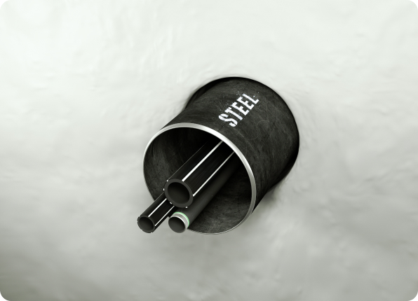
Some rules are counterintuitive even to experienced estimators. A parallel setup, two simultaneous bores, prices identically to a single. The calculations and studies are the same; only the physical count differs. Getting that wrong is the kind of error a spreadsheet lets through. This system cannot.
Every configuration ends at the same place: three cards. Essential, Recommended, Comprehensive. Each shows a total, a description, and what the package includes. The prices aren't fixed. They're multipliers on the subtotal the prior selections already computed. Three cards, wildly different math underneath: a Comprehensive HDD estimate under rail and road is a completely different number from Comprehensive AUGR under a service corridor.

The pricing model is modular by design: each factor lives as its own database entry. Pipe configuration cost goes up 5% next quarter? The commercial team changes one value, and everything downstream recalculates on its own.
The interface had to make all of this invisible. The user picks a package. The system already knows what that means.
When the wireframe
became the spec.
Once the logic was mapped, I needed to prototype at fidelity high enough to test with real engineers and drillers, people who would immediately spot anything that didn't behave like a genuine engineering tool.
I built the wireframes as a fully tokenised, variable-driven Figma component system. Selections in the prototype filtered subsequent options, calculated totals dynamically, and produced visually credible estimate outputs. Maths expressions inside the wireframe. Tokens for every state. Components that responded the way the production app would. Mapping which variable needed to reference which, and in what order, across five methods and layered crossing combinations, was its own logic puzzle: I used AI to reason through candidate branch structures before wiring any of them into Figma's variable system.

Then I hit Figma's then-current limit on nested complex components: two levels deep. My architecture needed four.
I spent a month iterating with Figma's engineering team on a workaround. We found one. Once unblocked, the wireframes behaved enough like a real product that user testers occasionally forgot they were testing a prototype; they started asking when they could finally use it.

That was the moment the project changed shape. The artefact wasn't a wireframe anymore. It was a functional spec the developers could read directly.
If it wasn't tested,
it wasn't built.
Testing wasn't a phase. It was the gate between phases. Engineering time is expensive, and the team only built what real users had already validated.
- Wireframe rounds (×3) Different domain experts caught different problems, each from their own specialty. The sleeve, pipe, and configuration logic, and its labeling, changed multiple times across the three rounds before it held up against every professional's scrutiny.
- Low-fidelity mockups Users building estimates with several boreholes had no way to tell them apart once more than one existed, and got lost navigating between them. Renaming, missing until this round, got added.
- High-fidelity mockups Progression cues, like the estimate button, weren't visible enough. Each borehole card's controls (rename, duplicate, delete, and more) cluttered its corner until testing consolidated them behind a menu, added collapse and expand for long estimates, and paired renaming with a sort-by option: naming finally had a function, not just a label.
We tested with engineers, drillers, and project managers: the actual personas, not stand-ins. Sessions alternated task-based ("get me a quote for a 50m service crossing under a rail line") and exploratory ("show me how you'd normally do this"). Exploratory won almost every time.
Task-based sessions confirmed the flow worked. Exploratory sessions told us more: users discovered on their own that boreholes could be duplicated and that estimates could be shared by email, without anyone showing them how. The interface was legible enough to reward curiosity.

A team that can't say no to feedback
builds a product that says nothing clearly.
Several features came directly from what users asked for during testing, most visibly a dashboard to track and revisit past estimates. Error states were another lesson. Failure modes we assumed users would understand needed explicit guidance; the tool's inline explanations and contextual graphics weren't a design flourish. They were a requirement.
Every insight from those sessions was raw material, not a verdict. We ran it all through a structured triage board in BugHerd: what was heard, what was decided, what was done about it. Each card carried its source persona, its session, and the team's reasoning for where it landed.
The lane that mattered most is the one nobody talks about: Discarded. Every card there needed a written reason; not every insight earns implementation. Some would've added complexity for one user at the cost of clarity for a hundred.
The board made something invisible visible: the distance between hearing a user and actually helping them. That distance is where product decisions live.
If it wasn't QA'd,
it wasn't shipped.
The front-end was Nadia Gerasimova's domain. She coded every screen, every state, every interaction. The user management flow in the dashboard was hers end to end. On the login flow she went further than the brief, researching independently and coming back with logic proposals. Most of what a user sees and touches in Borely, she built.
QA Against the Truth Table
The QA process ran through a purpose-built Excel macro: every valid configuration listed, expected output hidden from the tester but already stored in the file. Populating those 19,008 expected outputs from the team's source-of-truth pricing matrix was its own project: I used multiple AI models to generate the full enumeration and cross-check their outputs against each other before trusting any of it as ground truth. Combinations were shuffled once, then split into fixed daily batches. Working in-house, the tester moved through each daily batch. Logic-related issues were priority one, the internal team needed a tool it could trust, so those got fixed the same day they surfaced.
Each submission was silently checked against the stored expected output; any discrepancy triggered a joint review with the senior developer. Root cause fell into one of three buckets: coding error, logic design issue, or tester data entry. Every finding was logged with its category, notes, and resolution: a permanent record of what broke and how it got fixed.

The load surfaced bugs, content errors, and pricing inconsistencies that a standard walkthrough would have missed. All were fixed in-house; none reached a real user.
The stress test also surfaced something more fundamental. Under load, or on a slow connection, the tool occasionally failed to fetch data from the database before running calculations. Incomplete inputs produced invalid estimates; in some cases, corrupt data was written back to the database. A system that trusted the backend to always respond correctly was a system that would fail silently under real conditions.
The fix was architectural, and it solved for speed as much as correctness: stop relying on the database as the calculation engine. Run every operation live in the front-end instead, send the result to the backend, then compare it against the database's stored value. Diverge, and the estimate is flagged before it can be saved. The database became the validator, not the source. Since launch, monitoring has never caught a mismatch.
Final validation: the Borely commercial team used the tool to produce real client quotes for several weeks before public release. Real money, real clients, real consequences. That changes how you debug.
Authentication
The first plan for saving estimates was to store them anonymously, together, no accounts needed. That plan had a hole in it: two competitors bidding on the same tender could both be using the tool. Borehole quantities, specs, and crossing types were specific enough to identify whose estimate belonged to whom inside a shared, searchable pool. An anonymous database wasn't actually anonymous. It was a way to leak a tender.
The fix was accounts. Independent logins, estimates scoped to the user who created them, nothing pooled for anyone to search. A safe tender process, not just a saved one.
Borely is a webapp: no OS keychain, no device-native credential storage, and access required on any device a contractor picks up on-site. OTP, one-time password, routes around every one of these constraints. A one-time code, sent to a registered email or phone number, replaces the stored password entirely. No credential to forget, no account to lock out. The dynamic code also raises the security ceiling: it expires on use, so a leaked login page is useless without the inbox.
Use buttons to zoom · Drag to pan
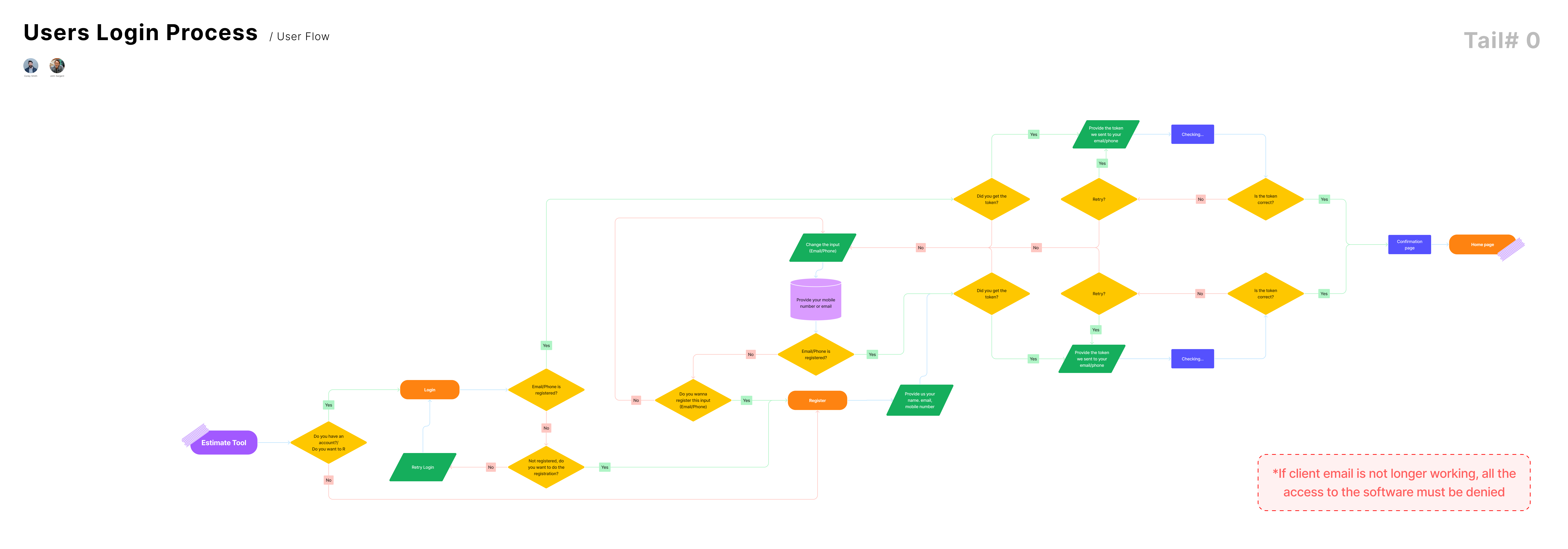
The authentication flow. Every branch resolves without a forgotten password.
The login experience, from first screen to dashboard.
Once authenticated, users reach the entry modal: manage existing estimates or start a new one. Two paths, no ambiguity. From there, the full estimate history is available for review, editing, or sharing: a public link exposes the configuration and price, with client and project details stripped out, so a contractor can forward a quote without exposing anything they shouldn't.
Accounts paid off twice over. Users got a return path: nothing vanished on close. The business got visibility: who was using the tool, for what, and a direct line from a self-service estimate to an assisted one. Every estimate carries a serial number; a user can hand that number to the team and ask for validation, revisions, or an official quote. A self-service tool that still knows how to hand off to a real person.
After Launch
The numbers landed where testing predicted. A complex multi-crossing estimate had previously taken a full week: chasing Colin for technical values, Andrew (operations) for inclusions, clients for project specifics. With Borely, the same job takes 3 hours. A straightforward one: under 10 minutes.
That time wasn't wasted effort. It was the cost of knowledge living in people instead of a system.
The knowledge became the system.
Colin's fear became a past-tense thing.
What changed most was invisible. Before Borely, the pricing logic lived in Colin's head. Every estimate required accessing him; his constant fear was forgetting something critical under pressure. The knowledge built into the tool went beyond even what he individually knew: engineering input, colleague review, deep sourcing to make every value accurate and current.
For users, the shift was autonomy. Previously, running an iteration meant approaching an FPS employee, waiting, and hoping time allowed another round. Now users explore on their own: cheaper options, faster methods, more comprehensive packages. No conversation required. The tool also works as an honest gate: users who could not afford the service found out from the tool, not from an awkward conversation. Users who assumed they could not sometimes found they could. The estimate speaks first.
Over 100 users across launch: engineers, drillers, and asset owners, some returning from testing, others discovering the product for the first time. Bugs got reported, questions came in, edge cases surfaced. Same-day responses, every time. Features got added because real users asked for them, not because a roadmap demanded it.

In September 2025, the estimate tool went live ahead of Melbourne No-Dig Week, the Southern Hemisphere's largest trenchless technology conference. The conference gave it its first massive public exposure: two 4K 27" vertical touch screens gave engineers, drillers, and senior technical professionals direct, unsupervised access: real scrutiny from the most technically demanding users in the field.

This is what it looked like in use.
The client-facing tool wasn't the only thing that launched. Kerry-Anne's internal dashboard, the operational layer behind it, went live shortly after: a live record of every estimate generated, searchable and retrievable for the team processing commercial output.


Before the dashboard, checking a client's estimate meant one of two things: asking the developer, or asking the client to resend the screenshot, PDF, or email the tool had already given them. After, the team could search, filter, and edit estimates directly, by method, user, or crossing type, and see who was using the tool and how often for the first time. Anonymous traffic became qualified leads.
How much of the reasoning to show
Every decision in this project came down to some version of the same question: how much of the reasoning should the user see?
A contractor will act on a price. An engineering manager wants to know where it came from. Corey Smith, our second persona, evaluated before he transacted, and he would not send a client a number he could not defend. The estimator produced that number from 19,008 configurations he would never see. Designing the calculation was half the job. Deciding how much of it to show him was the other half.
Each package card shows its complexity level, its name, and an inclusions list that changes with the tier: profile and alignment drawing, breakover drawing, settlement analysis among them. The three tiers give a user something to compare, and comparison is what turns a single price from an assertion into a judgement. The 19,008 rows stayed out of the interface entirely. Exposing them would have been honest and useless. Nobody validates a number by reading a spreadsheet. They validate it by seeing what it was chosen over.
That discipline held after launch too. Real users surfaced a gap the original flow never anticipated: some already had their own trenchless profile and alignment design and only needed the supporting calculations. We interviewed users to understand the need properly, then built and tested the feature itself with real users before shipping it.
Each package now carries a toggle: "Do you have a design?" Answering yes opens a module titled "Is it Borely compatible?", inviting the user to find out for themselves: vertical radii, pipe borehole entry, elevation difference, minimum grade, whether it's a shore approach, redrawing a live diagram with each choice, so an engineer recognises their own design in a picture instead of describing it in words.

"Not compatible" isn't a soft system limitation. It's Borely, the company, saying it will not calculate against a design outside its own standard criteria. Marking it blocks the controllers and adds a Profile & Alignment Drawing back into the package, since Borely can't do the math without one.
"Couldn't find your design?" offers the same honesty from the other direction: if a user's geometry isn't in the builder, they can say so and reach a specialist directly instead of forcing a guess neither side can verify.
It's exactly the kind of proof Corey needs before he transacts: not a promise that the price is right, a way to check it himself.
Any system that hands a person an answer they cannot check by hand raises the same question, and the answer is never to show everything. What gets exposed, what stays hidden, how someone corrects it, and how it fails out loud are all design decisions.
A senior product designer's job isn't to produce screens. It's to understand the constraint space deeply enough that the screens become inevitable.
The 19,008 configurations were already there: latent in domain experts' heads, scattered across workbooks. The work was to make them legible. First to myself. Then to the engineering team. Then to the user, in that order.
For decades, what you paid for a trenchless job depended on who you knew, what they remembered, and how their morning was going. Borely made that expertise consistent, accessible, and honest. That's what the next generation expects as a baseline.
Team: Santiago Botero, Mauro Vargas, Masahiro Yasuda, and Nadia Gerasimova built this. Colin, Andrew, and Kerry-Anne kept the runway clear.